Why is it my wife will always come home with a lottery ticket in a jackpot week? Statistically speaking, she is more likely to die in the car on the way to the shop than she is to win the $30 million draw.
She knows this. I tell her often enough.
Deep down, most people know that the odds are stacked so far against us that a lottery ticket could never be considered a sound investment. But we fickle humans don’t think or behave like logical, objective and dispassionate computers. Our decisions are far more subjective, relying on a different kind of evidence – experience.
And when we lack the personal experience to make a decision, stories and anecdotes allow us to imagine and internalise the second-hand experiences of other people.
You don’t think in statistics, you think in examples, in stories. You decide the likelihood of a future event on how easily you can imagine it.
David McRaney: You Are Not So Smart
And so adverts depict happy lottery winners on a world cruise, or happy parents paying off their daughter’s mortgage – just to help us imagine that statistically unlikely lottery win.
Each is a subjective view of one person (or family), because that is how we see the world — not as a statistical whole but as an entirely unstatistical personal experience.
 These fictional tales are then given credibility by regular newspaper stories of surprised jackpot winners talking about what they plan to do with the money. And so the weight of anecdotal evidence begins to outweigh the cold reality of statistics.
Never mind how improbable it is. Our imagination says winning is entirely possible. Gimme another Maxi-Pick and what was your brother’s birthday again?
This power of imagination over statistics isn’t always negative, tricking us to ignore the facts. Most of the time, storytelling can help us to understand otherwise abstract concepts with far greater ease.
The Evolution of Story
Storytelling has been at the centre of how our brains work since the first time someone told a tale around a campfire. Telling tales was a way of transferring personal experience to a wider group. This is how I hunted the mammoth. This is how I escaped the cave bear. This is how your ancestors lived.
Teaching by example. Sharing history. Communicating information in a way others can imagine within their own subjective view of the world.
Telling another member of the tribe how to make a fire still required a beginning, middle and an end of cause and effect. You do this, then that and the result is warmth and light. But if you do that, then this, the result is burned hair and lots of pain. Information and experience conveyed as story.
What do these facts mean to me?
A picture may be worth a thousand words, but an example is worth a thousand stats. [Tweet this]
Consider the recent debate in Australia over the two competing policies for the National Broadband Network (NBN). When the coalition announced their policy, almost all the reporting was confined to stats, numbers and details.
All of that discussion about upload/download speeds remained very abstract for most average consumers. My mum wouldn’t have a clue how those numbers would affect her daily usage of the internet. Therefore, many people latch onto the only numbers they do understand; one party’s plan will cost taxpayers less to implement across the country cheaper than the other. The reasons why it won’t work nearly as well are harder to grasp for most.
(2020 update: Not only didn’t this “cheaper” approach not work as well, it ended up costing more, not less, because of the new complexities it introduced.)
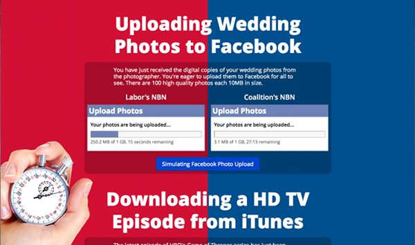
So I was extremely happy when James Brotchie — a Queensland university student – launched a website called How Fast is the NBN this week.
The site tells a number of stories in the form of common scenarios internet users may relate to, such as uploading wedding photos to Facebook. Each scenario is followed by a clever visualisation of how the different proposed upload/download speeds transform the experience for you, me, your mum and my neighbour.

Stories + examples > stats. Beautiful.
Yes, the politicians are arguing over whether the facts are misrepresented. The point I’m making isn’t about which NBN plan is better, but how James conveyed the numbers in such a way that this visualisation has become the most viral piece of NBN-related content in the controversial program’s history – one that people could understand, imagine and share.
So, next time you’re releasing that white paper on recent trends and statistical results, consider whether there may be a better way.
Is your headline a statistic or is it a story? Help your valuable information to resonate with more people by using examples.
We may be smart enough to understand your facts and figures. But you need to feed our imaginations as well.
